
Business cards - samples, rules, examples. What should a modern business card be like? A few examples and recommendations: Example of a person’s business card

Nowadays, anyone can have a business card, from the owner of a large business to Uncle Vanya, a mechanic. Both of them, distributing business cards, pursue the same goal: to serve more clients, increasing their income.
A business card is an essential attribute of the business world. In many cases, it creates a certain image for the person or company to which it belongs. But no matter how well this card is drawn up, they will be judged based on their deeds. It's best when both the first and second are flawless. This is obvious, but it is forgotten.
Business cards can be divided into three types:
Corporate— represents the company as a whole (as a brand), without taking into account any specific employees. Here you indicate the name of the company (logo), the type of its activity and contact information (location address, website, one main telephone number - not 5 numbers);
Employee business card— speaks about a person as about any position in a particular company. It is enough to indicate on it the name of the organization (logo) that this person represents, his first name, last name, patronymic if desired, contact phone number, email;
Personal business card- speaks of a person as a specific individual, unattached to any organization. It is characteristic, for example, of an artist, a photographer, a piano tuner, a gardener.
Regardless of the types described above, the essence of such a card is to very briefly make it clear who you are (what company), what you do and how you can be contacted. It is precisely because people do not understand these differences that some stupid things are thoughtlessly copied and continue to live.
It is not logical, for example, to put the company’s address and telephone numbers of all its divisions on the business card of a specific employee, because this is the card of a specific person, a specific position. If this is his business card, then it should be about him.
Printing a hundred or two of these business cards does not require much effort at all. The question is, will the information be presented correctly, will it be comfortable to read, and generally how aesthetically pleasing will this business card be?
A printer in a printing house rarely worries about these questions, because this is not his profile, and even if he understands, he doesn’t want to strain himself once again.
Without understanding this, you yourself are unlikely to be able to create something worthwhile, although at first glance everything seems very simple.
Just like someone superbly sews dresses to order - you, for example, having immersed yourself in your business of window profiles, are well versed in the materials and technologies used to produce these same profiles. But in design you know exactly as much as a programmer in medicine.
Professionals usually charge good money for such work, which is not clear to all customers. Amateurs will take little, but will do as best they can, due to their limited experience. They will take into account all your incorrect wishes, without removing the duty smile called “the client is always right”, they will pursue only one goal: to quickly finish with you and take on the next client.
One day, I came across two terrible business cards that needed the most severe criticism and work on mistakes. Actually, because of this, the desire to write this publication arose.
So, the first victim is an online store of household and office equipment (a double-sided business card):

On the front side we see clouds and a classic image of a telephone operator girl, of which there are plenty of Google searches for the same name. The designer (the author of the card) still found that deep non-existent meaning in this and connected it with the household appliances store. Clouds, because under no circumstances should a white background be left - the customer wanted “to be brighter and more creative, but at the same time to have some lightness.” The text is terribly flattened in some places, and stretched out in others, plus the ability to give a white outline to the font was demonstrated. On the back there is the same background, only without the girl, which made it possible to stuff a whole leaflet’s worth of text there, give it an ugly alignment and emphasize the address of the site that was written for the second time.
The client, seeing that all the free space was filled with a “bright” background and text describing the advantages of his company, thought that they had done a good job on his card, and with a clear conscience continued his path of wandering in misunderstanding.
This example of a disgusting business card shows that the text here is pressed to the edges, forcefully flattened and placed on a complex, meaningless background. All this is an example of bad taste in terms of design, typography and simply good manners.
Why is it that in books there is always free space from the text to the edge of the page, why is there this space (margin) in school notebooks and it is defined by a vertical red line separating the entries? Because the text, thus, does not stick to the environment, which allows you to concentrate on it and make its perception more comfortable.
I repeat once again that a business card, like a greeting, is intended for a brief introduction to a person (company), something like the binding of a book with the title and author, the contents of which are already on its pages.
The second victim is a business card from the director of a coal company (also double-sided, with similar text in English on the back).

There is not a lot of text here, unlike the previous version, but it all shimmers and shines like a circus pony. Reading it is a clear mockery. By the way, the cardboard itself is already mother-of-pearl (it’s just not visible in the picture).
The client most likely wanted originality, femininity (the director is a woman), and something that would “attract the eye.” The designer decided that everything should be shiny, and compensated for the small text with the Bold mode, as a result of which everything turned into lines. It turned out in the best traditions of amateurish bad taste. Neither the logo, nor the design, nor the text says anything about the direction of the company’s activities. The designer could not afford just white cardboard with black text, because he considers himself “creative” and in the eyes of the client also wants to keep himself as such. Unfortunately, such a card has no value, attractiveness or originality, but the funds were spent on cardboard and silk-screen printing.
The conclusion that follows is that there is no need to use any opportunity just because it exists. In this case, it’s a masquerade shine using special paint and cardboard, plus applying the Bold mode to the font.
And here is an example of excellent, in my opinion, business cards:
The company is engaged in landscape design

Stylist card in the form of a scallop
The main principle of building the image of a business person is harmony in everything. And since a business card is one of the components of this image, it must correspond to its owner, be effective, but not contradict the idea of a business person. Its main goal is to be informative; only in this case is the business card functional.
Present yourself brightly!
If you are a creative person (designer, event organizer, photographer or artist), choose unusual solutions for decoration. The picture on the back of the business card will illustrate your professional skills, and the non-standard texture or shape will be remembered for a long time. These pictures can be carved and the business card will not be repeated, which can also interest or even attract a potential partner!
The decoration of your business card can be colored geometric elements (triangles, stripes, squares) or a QR code - it makes the design modern and meaningful.
The Poly Print Service company has selected examples of business cards for creative, modern people who keep up with the times and are not afraid to experiment.
Stylish minimalism
Representatives of serious professions or managers should not use business cards with ornate patterns and bright colors. The best choice for them is strict, laconic business cards. By the way, they are considered the most stylish today.
Sample business card in minimalist style: a small image on the front side (for example, a logo) and data (contacts, name, key phrase) on the back.
Embossed business card
Examples of business cards with embossing - convex patterns of various shapes that give the business card an elegant, classic look.
QR code. Useful nuance
The QR code, which is known to be a modern way of encoding data (recognized by smartphones), can be seen on many business cards today. Here is the perfect way to redirect a client to an online portfolio or website. So, a QR code is both a decorative element of a business card and an “assistant” in promoting a business!
Games with fonts
If experimenting with shapes or colors isn't your thing, try playing with fonts! Examples of business cards with an unusual use of fonts - an original business accessory!
Innovation. Transparency
One of the most modern business card samples is a transparent plastic business card. It is much more wear-resistant and visually looks unusual compared to a paper business card.
The art of creating business cards
Business cards with unusual shapes are rightfully considered the most creative and impressive. However, keep in mind that this option is quite expensive and impractical - business card holders and bookkeepers are designed for business cards of standard sizes and shapes. And in a business card, as we said above, the main thing is information content and functionality.


Business cards are a popular topic of discussion and there is no doubt that they are extremely important. The Internet is full of examples of a wide variety of layouts. Today it is not difficult to buy creative business cards, both ready-made and original ones. Therefore, too ordinary a design becomes a problem.
Today I would like to give you some tips on how to choose the right business card design that is both impressive and effective. Your business card should work for you. To avoid hurting the designers' feelings, I asked a designer from CrazyPixels to create some samples. Of course, he did his best to draw attention to the details that I am about to talk to you about. The result is an incredibly modern and interesting business card design.
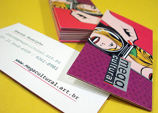
Pictures on a bright background
So here's the first design:
Bright and stylish business card. Attracts attention at first sight. If you? a creative person such as a photographer or designer, this business card will be the best choice for you. The image on the back can showcase your professional creativity and this business card can be part of your portfolio. You can create several versions of these business cards with different photos and give potential clients the opportunity to choose the one they like best. I'm sure they will remember you.
Here are some examples of great business cards with great photography and vibrant colors:


Use of colors
Just look at the design of this business card:

The pattern on a business card doesn't matter. It can be stripes, squares, circles or triangles; the appropriate color scheme remains decisive. Like the previous model, this business card attracts attention with its design, but at the same time it is not one-color, but represents a whole range of colors. I also want you to notice the QR code on this business card. The dots on the QR code are made in the same color scheme as the entire card. It's a small thing, but it adds meaning to the design and makes it more interesting.
Review of business cards with interesting colors:


Minimalist design
A completely minimalist logo designed in one color while creatively using the white space on the front of the business card? a great way to make a stylish card. You can place a logo or any other image on the front side, and all the necessary information? on the back. This could be a name, a key phrase, or contact information. There are many options for creating similar designs:
Business cards with minimalist design:


Embossing (letterpress effect)
Embossing? This is a way of using a stamp to create a raised design of different shapes on a business card. This effect gives your business card texture, style, and a classic look. Does this allow you to only use one color? the original color of your business card paper. This makes the business card look modern and elegant.
Embossed business cards:


Adding QR codes
QR code? This is a modern version of encoding information that can be recognized using a smartphone. The code may redirect you to a website, online portfolio or resume. This is a great way to bridge the gap between your business card and your online work. Make sure your target audience is able to use this communication tool before you make yourself business cards with a QR code.
Creative business cards with QR codes:


Font design
Font design is a popular trend that is worth paying attention to. It can be difficult to find the right font, but there is a huge amount of choice available, so you'll be sure to find the right font...
Business cards based on font design:


Transparent business cards: a new idea
Examples of transparent business cards design:


Black and white
Black and white business cards will be an excellent choice for businessmen, economists, lawyers and all those who are considered “serious business”. If you're looking for a simple, elegant, classic design, black and white business cards may be what you're looking for.
Black and white business cards:


Unusual shapes
These business cards have unusual shapes and in most cases are individual designs. Business cards with unusual shapes are more expensive than regular ones. They may make a bigger impression, but your customers may be quicker to throw them away due to the odd shape that doesn't fit their pockets. You should think about this option from the perspective of a potential client.
Here are some examples of unusually shaped business cards:


Logical conclusion
When it comes to creating business cards, try to do something unusual. There is only one chance to make a first impression on potential clients. Try this and you will see what works best. Your business card should represent your brand and your name. I hope this collection has inspired you to create unique and creative designs for your own business cards.
Publications on the topic
-
 Prince Askold in the history of Kievan Rus
Askold and Dir are legendary princes who ruled the city of Kyiv at the end of the 9th century, converted to Christianity and laid the foundations of the ancient Russian...
-
 “White lie”: Why don’t Greek Catholics admit that they are not Orthodox?
Kyiv Patriarchal Cathedral of the Resurrection of Christ. Cathedral of St. George in Lviv.